10 Year Local House Prices on a Map of Attleborough
Over the past decade, Attleborough’s property market has painted a vibrant picture of change. Our latest map reveals how different parts of the town have grown — from modest rises in some areas to striking surges in others. Discover how your street fits into Attleborough’s evolving story of house prices and local value.
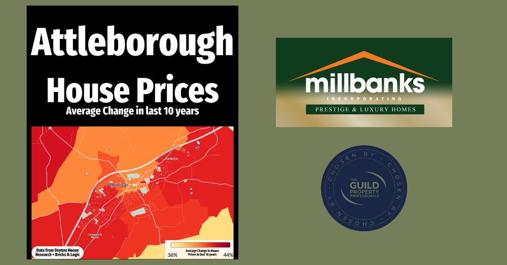
Attleborough House Prices: What’s Happened in the Last 10 Years
This map shows how house prices have changed across Attleborough over the past decade. The lighter yellow areas represent the parts of Attleborough where average house prices have seen smallest rises, the orange shades in the middle increases, while the deep reds show the strongest house price growth.
It is a fascinating picture because it highlights how no two areas perform in quite the same way. Even within the same town, some pockets have surged ahead while others have grown more modestly. That is the beauty of the local property market, every street has its own story, and averages can only tell part of it.
Of course, these figures are just that, averages. Every home and every sale is unique. Factors such as property style, condition, school catchment, and nearby amenities can all influence an individual home’s value, sometimes well above or below the local average.
If you are a Attleborough homeowner thinking of moving in 2026, now is a great time to get a clearer idea of what your property might be worth today. Contact us for an obligation-free market appraisal, and we will show you where your home fits into the current Attleborough picture.
Call me anytime for a 'property chat', on mobile 07970 203228, the office on 01953 453838, or email tony@millbanks.com .With over 41 years of experience in property sales and marketing, I’m can offer clear guidance and support every step of the way.
Thank you for reading.
If you'd like to find out what your home might be worth in 60 Seconds, please 'click' the banner ad below.