AT HOME Does the Boiler Upgrade Scheme go far enough?🔨🏡
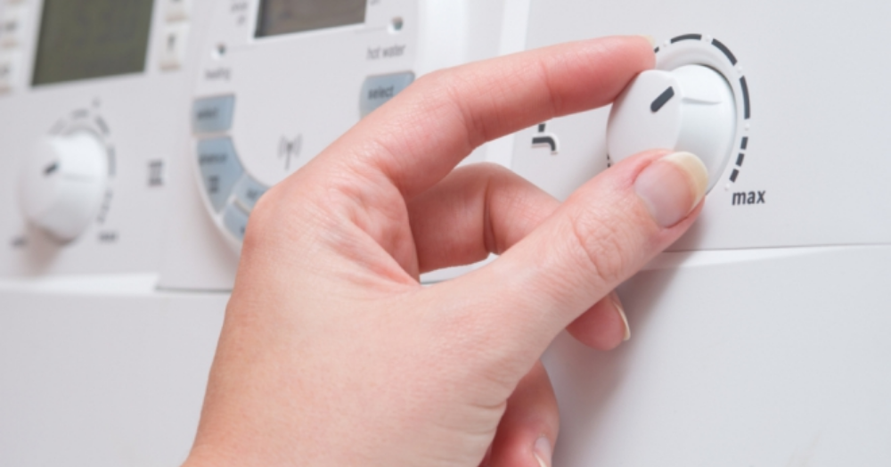
The start of this April will see households able to apply for grants up to £5,000 to support the switch from using gas boilers to eco-friendly heat pumps when their current boiler needs replacing.
This initiative comes as the government cracks down on carbon emissions in order to reach the 2050 net-zero targets and will significantly reduce fossil fuel consumption as well as slashing energy prices. To continue reading, please Click Here