Big Millbanks Sponsorship Announcement
We are proud to announce that for the 22nd consecutive year, Millbanks will once again be an official Norwich City FC player kit sponsor for the new forthcoming season 20/21
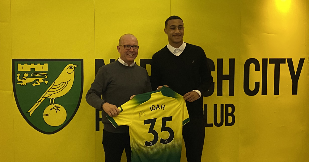
We are delighted to confirm that we shall, for the 2nd consecutive season, be sponsoring Adam Idah. Adam made his first team debut last season scoring a memorable hat-trick in the FA Cup victory at Preston North End in January and has since made several cameo appearances from the bench in the Premier League. We wish Adam and all at Norwich City the very best for the new season.