House Prices in the last 10 years!

House Prices in the last 10 years!

This map highlights how uneven UK house price growth has been over the last decade. While some regions have surged ahead, others have seen far more modest gains. It’s a clear reminder that national averages hide wide regional differences, and that property performance is always shaped by local markets rather than headlines.

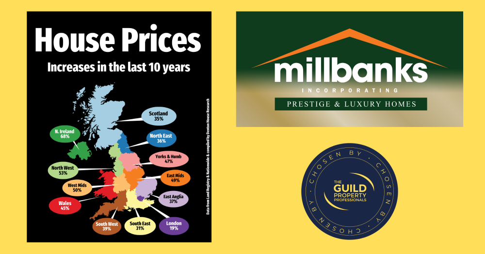
When you look at the UK property market over the last 10 years, the picture is far from uniform. Northern Ireland has seen house prices climb by an eye-watering 68%, while London has managed just 19% in the same period. 
 
·     Northern Ireland: 68%
·     North West: 53%
·     West Midlands: 50%
·     East Midlands: 49%
·     Yorkshire & Humber: 47%
·     Wales: 45%
·     South West: 39%
·     East Anglia: 37%
·     North East: 36%
·     Scotland: 35%
·     South East: 31%
·     London: 19%
 
This sort of map comparison is really useful because it shows how different areas have moved at very different speeds. It reminds us that property is always local. National headlines often talk about one big UK figure, but the reality is that your experience in Attleborough will be quite different from someone selling in Belfast, Bristol, Edinburgh, Manchester or London.
 
What stands out to you when you look at these figures?

If you'd like to find out what your home might be worth in 60 Seconds, please 'click' the banner ad below


Get in touch with us

UK home sales agreed in 2025 tell a story of steady progress rather than drama. Many regions are seeing uplift thanks to realistic pricing and strong demand, while others are adjusting to affordability and expectations. The market is functioning, confident, and increasingly shaped by local conditions.

Attleborough homeowner or landlord? Each month we track the average price paid for local properties over the last 12 months to reveal where the market is really heading. If you’re thinking of selling or simply curious about your home’s true worth, staying informed puts you ahead.

This heat map uses census data to show where Attleborough residents work longer hours, revealing clear differences in working patterns across the town. By understanding how work-life balance varies between neighbourhoods, we gain useful insight into local lifestyles and the factors shaping our community.

Nearly one in four agreed house sales in Attleborough failed to complete in 2025, a figure that catches many homeowners by surprise. This article explains why so many moves fall through, what it really costs local sellers, and the practical steps Attleborough homeowners can take to reduce risk and improve their chances of a successful move.