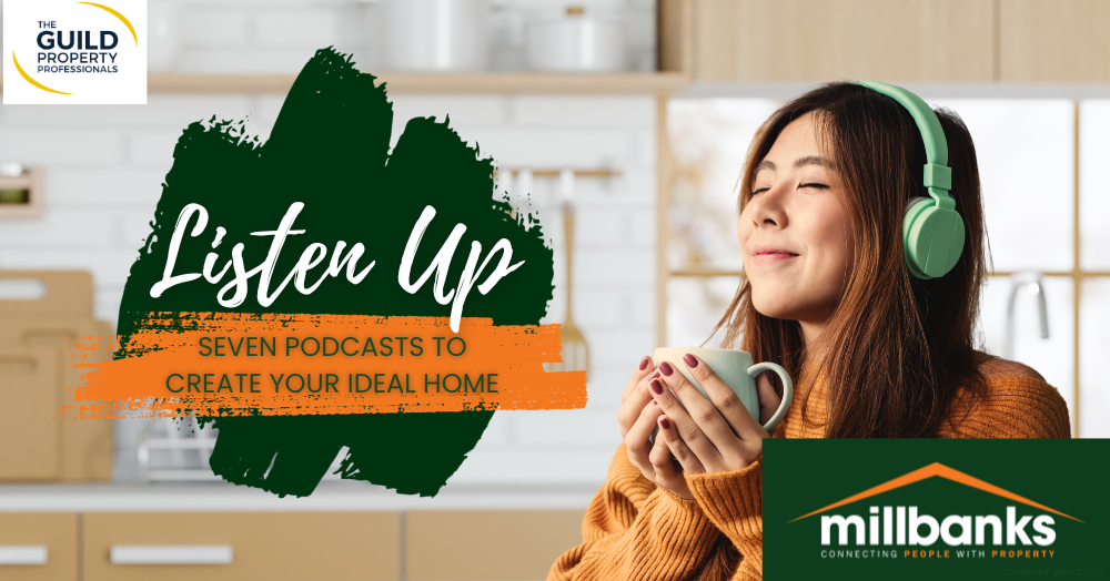
Listen Up – Seven Podcasts to Create Your Ideal Home
In this community interest article, we look at seven podcasts to give you some ideas and inspiration for creating your ideal home.
We’re becoming a nation who are passionate about podcasts.
Podcast listenership in the UK has been increasing yearly, reaching an estimated 21.2 million listeners in 2022 according to the Statista website.
From relationships to Russia, history to histrionics, and anything else you can think of – there’s a podcast themed around it.
And people seeking homely ideas aren’t overlooked either.
So, if you want to spruce up your living space, turn your garden into an oasis, stay ahead of interior design trends or seek inspiration for a major home refurbishment, we’ve created a podcast playlist for you.
These seven UK-based shows are the perfect companions for your home improvement journey.
1) “The Great Indoors” by Sophie Robinson & Kate Watson-Smyth
Why listen: For the newest and coolest in interior design, Sophie Robinson and Kate Watson-Smyth have got you covered.
2) “Home Stories” by Amanda Nelson
Why listen: Real homeowners like you share their personal renovation stories – think of it as a cosy chat over a cuppa.
3) “Material Matters” by Grant Gibson
Why listen: Delve into the world of materials and learn how choosing the right ones can make your home extraordinary.
4) “Upcycled Hour” by Chris Billinghurst
Why listen: Discover how to turn your trash into treasure, one upcycling project at a time.
5) “At Home With...” by Lily Pebbles & Anna Newton
Why listen: Take a virtual tour of inspiring homes as Lily and Anna chat about what makes a home special.
6) “The Interior Design Business” by Susie Rumbold & Jeff Hayward
Why listen: Even if you’re not a professional designer, the insider tips from Susie and Jeff are invaluable for making your home a stunner.
7) “The Skinny Jean Gardener Podcast” by Lee Connelly
Why listen: Don’t forget the great outdoors! Lee Connelly offers easy-to-follow gardening advice for turning your patch of green into paradise.
From interiors to gardens, upcycling to renovations, these podcasts offer home lovers a treasure trove of ideas, entertainment and advice.
Let us know what podcasts you’d recommend to people in Attleborough.
