More properties WANTED
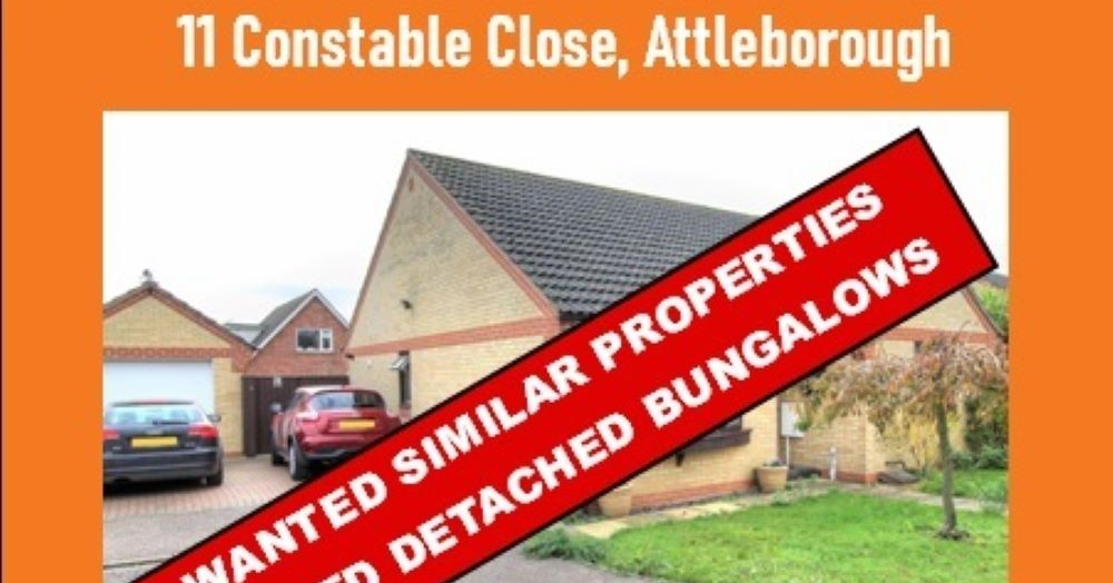
11 Constable Close, Attleborough sold in less than 24 hours from our database of buyers and pre marketing strategy.
11 Constable Close Attleborough - Sale agreed in less than 24 hours.
With the housing marketing still very exciting we have a shortage of properties within the NR16 and NR17 postcodes especially 2 and 3 bedroom bungalows.
We had a number of buyers actively looking who missed out on this property.
If you are thinking of moving and would like an indication of the value of your property please use our free instant valuation tool Or if you would like a free bespoke valuation of your property please contact us on 01953 453838 or email us at propertysearch@millbanks.com.
We look forwards to hearing from you.