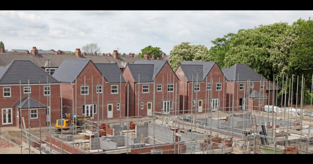
Get in touch with us
What does Attleborough really look like beyond house prices? This map highlights where larger households are most common, revealing where families and shared living arrangements are concentrated. The pattern shows how different neighbourhoods function as distinct micro markets, each shaped by the people who live there. Click to learn more...
April is a good time for buyers to focus on readiness rather than guesswork. In a market where choice has improved but confidence remains mixed, being organised can make all the difference when the right home comes along.
Timing can make or break a house sale. New Attleborough property market data reveals why the first few weeks are critical, how overpricing can cost sellers valuable buyers, and why homes that sell quickly are far more likely to complete. The numbers tell a powerful story. Click the link to learn more...
This heat map reveals how rental yields vary across Attleborough, with darker areas delivering stronger monthly income and lighter zones producing lower returns. It also highlights a key investor insight: higher yields often sit opposite to long-term house price growth, showing why local strategy matters. Click to learn more...