Percentage % Chance of Moving / Saleability
Saleability is about more than just securing an offer—it’s the journey from listing to handing over the keys. Higher-value homes often face smaller buyer pools, tougher lending checks, and longer chains, which can make completion harder. Success lies in preparation: realistic pricing, organised paperwork, and clear communication to keep the process
Saleability is not the moment a home is marked Sold Subject to Contract. It is the percentage of homes that make it from coming on to the market to exchange of contracts and legal completion, when everyone is legally tied in and the move happens.
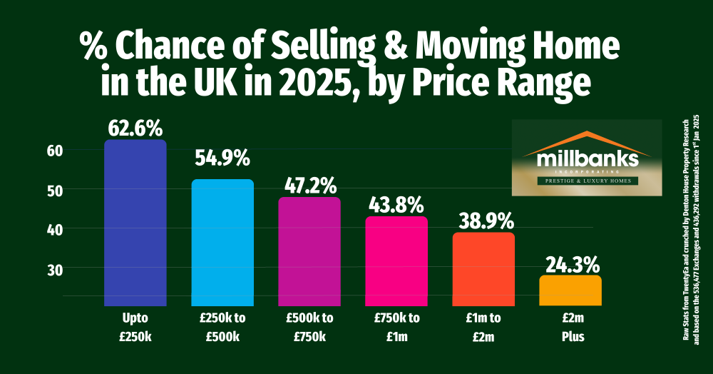
These are the stats for UK property market
• Up to £250k, 62.6% reach completion.
• £250k to £500k, 54.9%.
• £500k to £750k, 47.2%.
• £750k to £1m, 43.8%.
• £1m to £2m, 38.9%.
• £2m plus, 24.3%.
Why do the odds thin as price rises?
Buyer pools are smaller, lending checks are tighter, affordability issues arise, estate agents over value more, chains are longer, survey issues bite harder, and decision times stretch.
To improve your own chances, set a realistic asking price based on very recent completions, not wishes.
Have funds and proof ready. Instruct your conveyancer early and complete all forms in advance. Gather documents like guarantees, planning consents, and warranties. Map the chain clearly and agree a simple update rhythm so problems are found and fixed before they grow.
Saleability begins before the home coms on the market and ends with keys in hands (and cash in the bank). That is the measure that matters, and that is where attention belongs.
In the coming weeks, I’ll be looking at the availability rates of properties in Attleborough on my Attleborough property market blog.
Call me anytime for a 'property chat', on mobile 07970 203228, the office on 01953 453838, or email tony@millbanks.com With over 41 years of experience in property sales and marketing, I’m can offer clear guidance and support every step of the way.
Thank you for reading.
If you'd like to find out what your home might be worth in 60 Seconds, please 'click' the banner ad below