Percentage of Homes Built in Attleborough After 1970
Attleborough’s property market reveals a clear pattern when viewed by housing age. This map shows the percentage of homes built after 1970, highlighting how different areas have developed. From period charm to modern layouts, knowing where newer or older homes sit helps me guide buyers and sellers with tailored, informed advice.
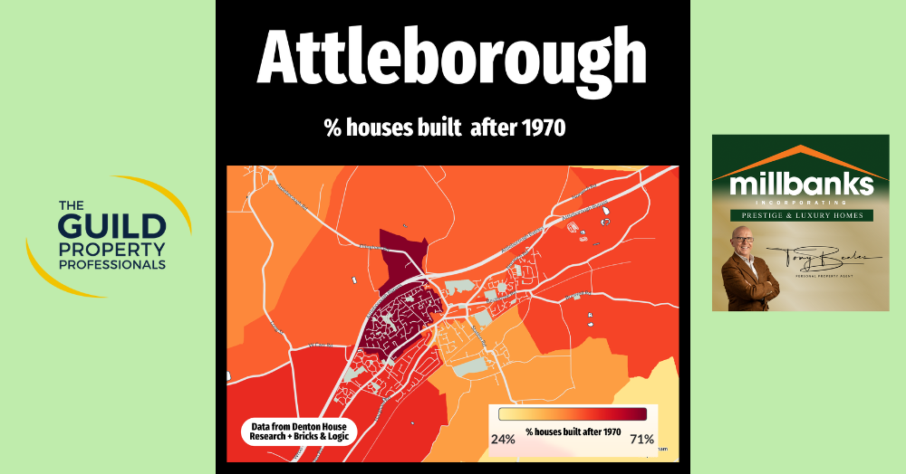
Attleborough's property market tells a fascinating story when you break it down by the age of housing stock. The map shows the percentage of homes built after 1970, giving real insight into the town’s development patterns over the past fifty years.
The grey areas represent neighbourhoods where no new homes have been built since 1970, often comprising older, more established properties with period charm and character. In contrast, the lighter yellow and orange shades highlight parts of Attleborough where some new housing has emerged, but growth has been more modest.
The darker red zones reflect concentrated newer development; more Attleborough homes built after 1970. These pockets typically offer more modern housing, better insulation, and layouts that suit today’s lifestyles.
Understanding the age profile of housing is essential when advising buyers and sellers. Some buyers seek the character of older properties, while others prefer the convenience and efficiency of newer builds.
As an estate agent in Attleborough, I make it my business to understand these differences, so I can better guide clients based on their needs and the local property landscape.
If you're thinking about moving home or selling a property—and this article has sparked some questions or curiosity—I’d love to hear from you. You can reach me at anytime on 07970 203228, or call the office on 01953453838, or you can drop me an email tony@millbanks.com. I’d be delighted to share insights from my 41 years of property sales and marketing experience with you and help plan your next steps.
Thank you for reading.