% Percentage of Homes Owned Outright
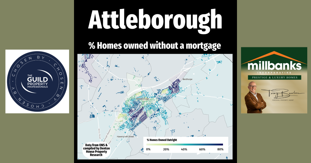
Understanding homeownership patterns in Attleborough reveals valuable insights for anyone in property. This snapshot highlights where residents own homes outright, mortgage-free. Darker blues mark higher equity areas, while lighter greens show fewer outright owners—indicating who may hold more flexibility in the market.
Understanding the makeup of homeownership in Attleborough is important for anyone working in property. This graphic highlights the percentage of homes owned outright, without a mortgage. The darker blue areas show where a higher proportion of residents own their homes mortgage-free, while the lighter green shades indicate areas with fewer outright homeowners.
This data doesn’t include those who own with a mortgage, or homes that are privately rented or owned by the local authority. That’s something I'll cover in future updates. For now, this snapshot gives a useful indication of where the highest levels of equity sit in the town.
Why is this relevant? Because people who own outright often have different motivations when it comes to moving. They’re not impacted by interest rates in the same way and may have more flexibility when it comes to timing and price.
As a Attleborough estate agent, I believe it’s important to understand these local patterns. It helps me provide better advice to buyers and sellers. The more we know about who lives where and how they own, the better we can serve our clients.
For a chat about property related matters, call me anytime on mobile 07970 203228, the office on 01953 453838, or email tony@millbanks.com With over 41 years of experience in property sales and marketing, I’m can offer clear guidance and support every step of the way.
Thank you for reading
If you'd like to find out what your home might be worth in 60 Seconds, please 'click' the banner ad below