Percentage of Households with Retirees
Understanding Attleborough’s housing market means looking beyond prices and trends. The distribution of retired households reveals key insights into who lives where—and why. Exploring these patterns helps explain how age demographics shape property demand, investment, and local housing dynamics.
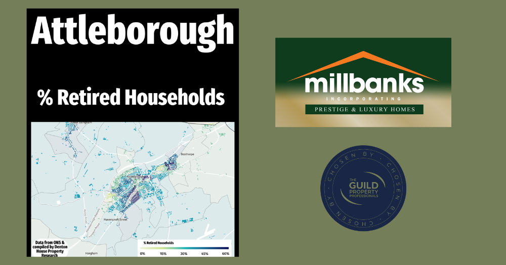
When it comes to understanding the housing market in Attleborough, it is not just about prices, supply, and demand. The demographic make up of different neighbourhoods plays a huge role in shaping how the property market works. One of the most telling insights is the proportion of retired households across the Attleborough.
The map above highlights where retired households are concentrated. The darker shades show areas with a higher percentage of retired households, while the lighter shades represent parts of Attleborough where retirees make up a much smaller proportion of the population. This variation matters because it offers clues about who is most likely to buy or rent homes in different parts of Attleborough.
For estate agents, landlords, and even homeowners thinking about their next move, knowing where more mature households tend to live can help shape decisions. Retired homeowners often have different housing needs compared to younger families or professionals, whether that is downsizing, moving closer to amenities, or seeking low-maintenance homes. Equally, investors may see opportunities in areas with fewer retired households, where there could be stronger rental demand from younger tenants.
By examining this data, we can start to see patterns that influence the balance of supply and demand in the Attleborough housing market. It is another reminder that property is about people just as much as bricks and mortar, and the way different age groups are distributed tells us a lot about the future direction of our local property market.
Looking at the map, is there anything that jumps out at you as different or surprising?
Call me anytime for a 'property chat', on mobile 07970 203228, the office on 01953 453838, or email tony@millbanks.com .With over 41 years of experience in property sales and marketing, I’m can offer clear guidance and support every step of the way.
Thank you for reading.
If you'd like to find out what your home might be worth in 60 Seconds, please 'click' the banner ad below.