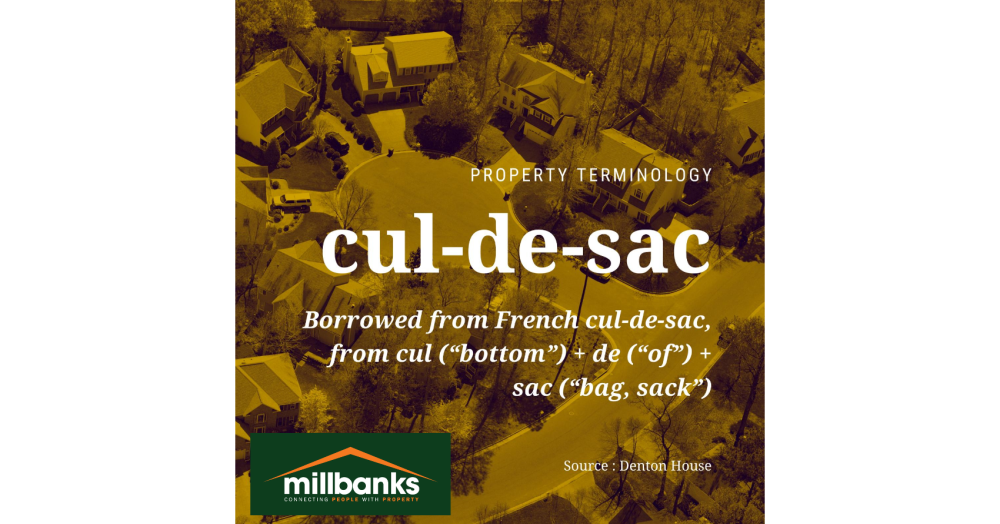
Get in touch with us
Private renting has grown across every UK region over the last 40 years, but the scale and pace are often misunderstood. This graphic shows how uneven that growth has been, shaped largely by the decline in social housing. Understanding this shift helps explain today’s housing balance and the choices ahead.
With plans announced to raise the council tax surcharge on higher-value homes, this snapshot looks at how many £2m-plus properties have actually sold across the UK this year. The data shows a highly concentrated market, dominated by London, and reveals just how small this sector is nationally despite the noise around a “mansion tax.”
Attleborough homeowner or landlord? Each month we track the average price paid for local properties over the last 12 months to reveal where the market is really heading. If you’re thinking of selling or simply curious about your home’s true worth, staying informed puts you ahead.
At first glance, Attleborough looks like any market town. Look closer and its housing tells a richer story. This map reveals where flats cluster near the centre and key routes, and where houses dominate the outskirts. From apartment pockets to house only estates, it shows that Attleborough is not one market, but several shaped by property type.