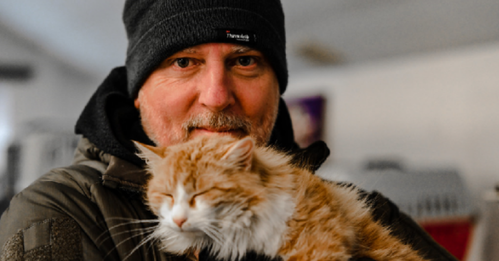
Property Tribes Co-Founder vowes to save Ukraine's pets🐶🐰🐱
Originally setting off to the Polish/Ukraine border over a week ago with a car full of supplies for Ukrainian refugees who are fleeing the war, Property Tribes Co-Founder, Nick Tadd, is still there and has vowed to help with the evacuation of the country's animals.
Nick was in Przemysl, a small city in Poland on the Ukraine border, roughly 100km from Lviv, when we caught up with him as he was buying supplies for the next day.
He told Property Reporter that although he was safe and well, he was aware that hostilities were getting close and was unsure what the situation would be like there in the next few days. To continue reading, please Click Here