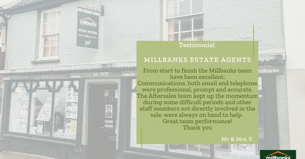
Thanks for the feedback πππ


The latest data suggests housing affordability is quietly improving, but the real story lies beneath the headlines. Itβs not just about house prices versus earnings, itβs about what buyers actually pay each month. And when you look at it that way, the picture may surprise youβ¦ read the article to learn more.
The way 25β34 year olds live in the UK has changed, but not as dramatically as often suggested. Homeownership is down slightly, while private renting has risen sharply, showing more of a delay than a decline in buying. These shifts shape demand in every local market, including Attleborough. Are there any surprises here?
This heat map reveals how rental yields vary across Attleborough, with darker areas delivering stronger monthly income and lighter zones producing lower returns. It also highlights a key investor insight: higher yields often sit opposite to long-term house price growth, showing why local strategy matters. Click to learn more...
Across almost every UK region, houses are more likely to sell than flats. In some areas the gap is small, in others it is dramatic. Scotland is the only exception, where flats outperform houses. So what is driving this divide, and what does it mean for homeowners in Attleborough? Click to learn more...