UK Rents Up Since 2016 … But Some Still Lag Behind Inflation
Rents have surged unevenly in recent years, revealing a striking divide shaped by shifting incomes and tenant affordability. While some areas have seen rapid momentum, others have moved more steadily, exposing a complex landscape that reflects economic pressures and evolving demand in communities.
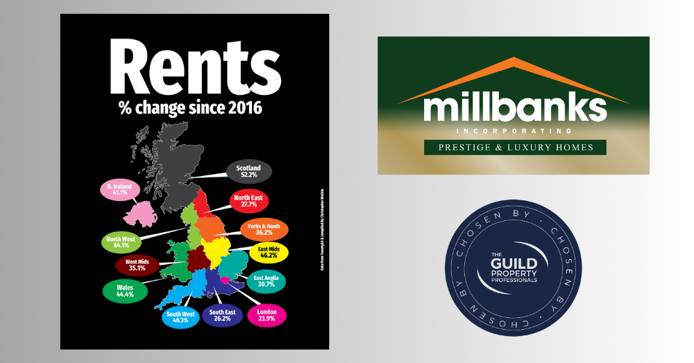
Across the UK, rents have climbed sharply since 2016, though not everywhere has kept pace with inflation, which stands at around 38% over the same period. The map shows just how varied the growth has been, revealing a fascinating north-south divide in the rental market.
Leading the pack is the North West, where rents have rocketed by 64.1%. Close behind are Scotland at 52.2% and the South West at 48.3%. The East Midlands follows with 46.2%, then Wales at 44.4%, and Northern Ireland at 41.1%. In the middle of the table are Yorkshire & the Humber with 36.2%, and the West Midlands at 35.1%.
Moving further south, growth has been steadier. East Anglia has seen a rise of 30.7%, while the North East has edged up by 27.7%. The South East, one of the UK’s most expensive regions for tenants, has seen rents rise by a relatively modest 26.2%, and London, surprisingly, sits at the bottom with just 23.9% growth.
The pattern tells an important story. In regions where wages have risen faster, rents have been able to climb further too. Rental prices generally move in line with tenant affordability rather than landlord ambition. When household incomes rise, so too does the ceiling for what tenants can pay.
For tenants, the figures highlight where affordability has been most stretched. For landlords, they show the areas with the strongest rental demand and capacity for growth.
While the cost of living has risen across the board, not all rental markets have responded equally. Some regions have surged far beyond inflation, while others are still catching up.
These are my thoughts. What are yours?