What Is Wabi-Sabi and Would It Work in Your Attleborough Home?
Forget Scandi style or minimalist chic, the interiors trend of the moment is wabi-sabi – an approach to design that’s gentler on the environment and the bank balance.
So, what is this concept with the weird rhyming name all about, and could it work for you?
Wabi-sabi has been popular in Japan for hundreds of years, where it’s considered more than a design aesthetic but a whole philosophy.
Rooted in Zen Buddhism, it celebrates the beauty of nature and all its imperfections. It’s about paring things back and embracing interesting, quirky items, especially ones that have stood the test of time.
So, instead of rushing out to buy lots of shiny, new, mass-produced belongings, wabi-sabi devotees take the slow lane and create a calming environment with a few well-made items.
There are two big advantages to this approach. Firstly, you don’t have to spend lots of money, and secondly, it’s better for the environment than investing in mountains of flat-pack furniture.
Here’s how you can incorporate wabi-sabi into your home.
Colours – Avoid screaming bright colours and use a neutral palette of white, cream, grey and taupe.
Textures – Opt for natural materials such as wood, jute, leather and linen.
Shapes – In terms of accessories like lights and vases, go for organic curvy shapes rather than rigid or straight edges.
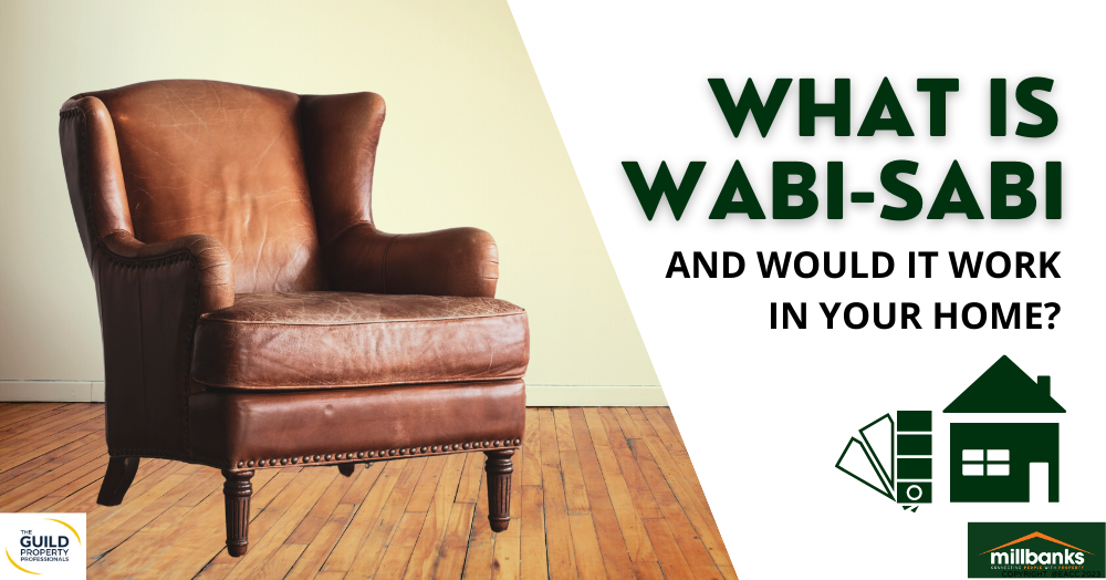
Declutter – Rooms full of ‘stuff’ feel chaotic not zen, so have a bit of a clear-out. Hold on to quality items that are special or unique. An old wooden dining table that has been in the family for generations or a weathered leather chair perfectly sums up the wabi-sabi concept.
Get handy – If you have a DIY background, consider using reclaimed timber to make your own furniture.
Repair – A classic example of wabi-sabi is kintsugi pottery, the practice of gluing broken ceramics back together with gold lacquer. Get creative and repair or rework a treasured item to give it a new lease of life.
Go bargain-hunting – Search second-hand furniture websites or charity shops for good quality, one-off pieces.
Relax about finishes – Exposed beams and brickwork fit the wabi-sabi look.
What’s your favourite interiors trend? Let us know.