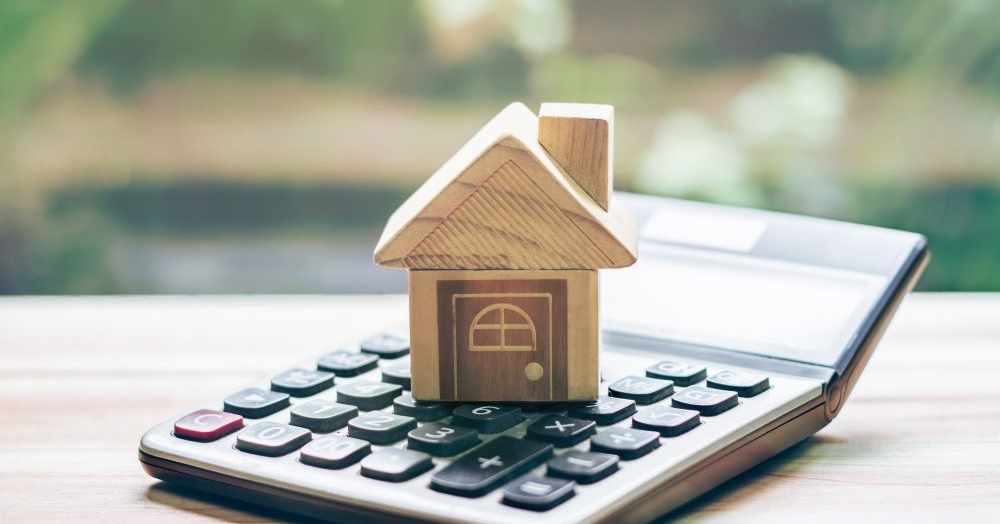
Why You Might be Disappointed With Your Instant Valuation?
Remember when you made the decision to buy your home and why you did, along with the improvements made since? Well, an instant valuation is calculated by a computer algorithm, using previous sales data, which can vary and doesn't take this into consideration, so can be inaccurate at times.
If you are disappointed with the result of your instant valuation. Don't worry, it may be the computer algorithim. Why not get a more bespoke valuation tailored to your property.
If you are thinking of selling but not quite ready to have our valuer out to your property, why not try our social distance valuation option.
Without the need for us to visit, just tell us about your property on this form, upload some photos and with our expert knowledge we will send you a detailed report within 24 hours.
Perfect if you are looking to move in the next 12 months.

If you're ready to take the next step to selling your property, why not book a Face to Face Valuation
This is a home visit where we talk to you in person, discuss your property and also your plans on moving on.
Using our expert knowledge we will provide you with a price and marketing strategy, detailing how we can achieve the best price for your property.
