BLUE HEAT MAP – % of Detached Homes in Attleborough

BLUE HEAT MAP – % of Detached Homes in Attleborough

Highlighting the Varying Percentages of Detached Homes in Attleborough

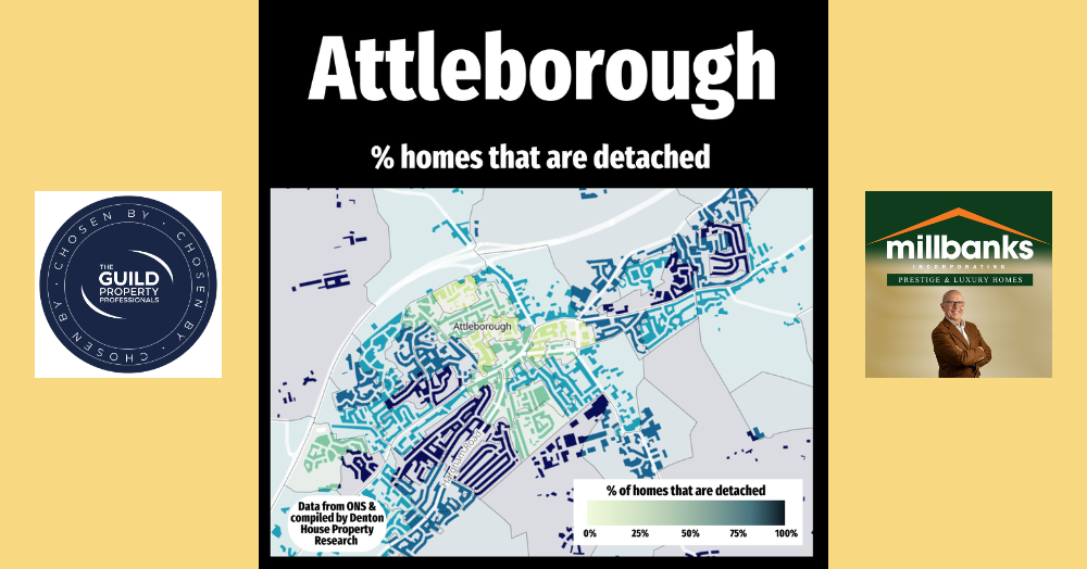
This map highlights the varying percentages of detached homes across different parts of Attleborough.
 
The areas shown in darker shades represent neighbourhoods with a higher proportion of detached properties, while the lighter shades indicate areas with fewer detached homes. This is a great visual representation of how different parts of the town offer distinct property types, catering to a range of preferences and needs.
 
This week, I wanted to focus on where the detached homes are situated. In the coming months, I'll be sharing similar insights into where other types of properties, such as semi-detached homes and flats, are located. 
 
It’s always fascinating to see how the mix of property types of in the different parts of Attleborough. If you’d like to stay updated on these insights and other local property market trends, follow me on social media for more interesting information about the Attleborough property market!
 
Let me know your thoughts and if there are any surprises on the map in the comments.


Get in touch with us

This map reveals how detached homes are spread across Attleborough, highlighting neighbourhood differences in housing types. Darker areas show higher proportions, while lighter zones reflect more terraces, semis and flats, with a clear pattern of detached homes on the outskirts shaped by historic growth and urban expansion. Click to learn more.

Across almost every UK region, houses are more likely to sell than flats. In some areas the gap is small, in others it is dramatic. Scotland is the only exception, where flats outperform houses. So what is driving this divide, and what does it mean for homeowners in Attleborough? Click to learn more...

The rental market remains active in May 2026, but conditions are changing. Demand is still strong, rent growth has eased, and tenant expectations are rising. Here is what landlords should be thinking about now.

This heat map reveals how rental yields vary across Attleborough, with darker areas delivering stronger monthly income and lighter zones producing lower returns. It also highlights a key investor insight: higher yields often sit opposite to long-term house price growth, showing why local strategy matters. Click to learn more...