Can you help!?
Are you thinking about selling your East Harling property?
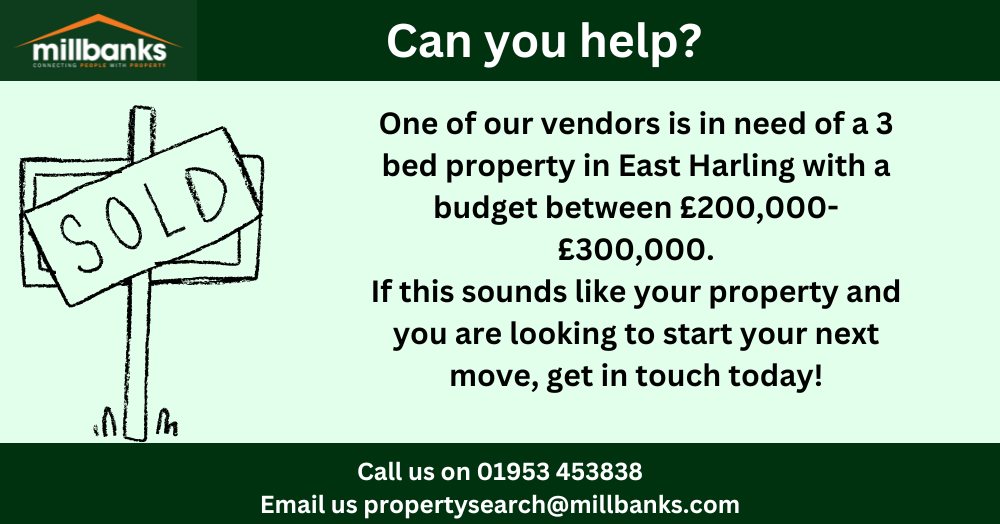
Can you help!?
One of our vendors is looking for a property in East Harling. He is looking for a 3 bed property with the price range between £200,000-£300,000.
Are you thinking of selling your East Harling property or not of anyone who is? If so, get in touch with us by calling 01953 453838 or emailing us on propertysearch@millbanks.com