DON'T MISS OUT ON VIEWING THIS PROPERTY!
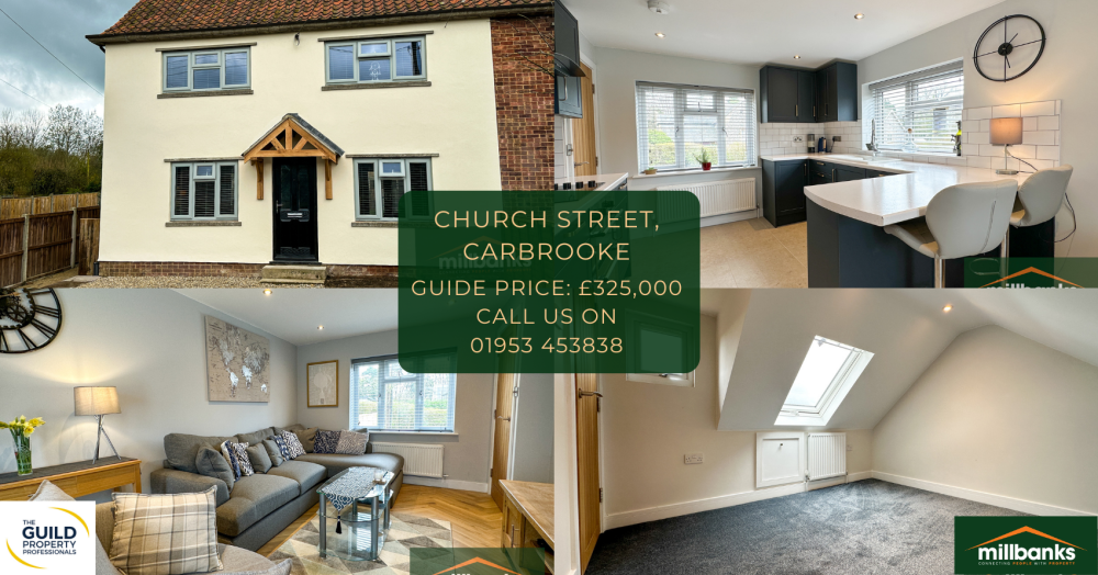
Take a look at this beautiful, refurbished and modernised ex local authority semi detached house providing 3 storey accommodation in Carbrooke!
Now is your chance to see this superb family home beautifully presented throughout situated in the lovely village of Carbrooke. It benefits a range of new fitted fittings including internal doors, windows and central heating system , this impressive contemporary home is stylish and modern and is all finished off to a high exacting standard throughout. It also comes with off road parking!
You don't want to miss out on this one!
For full details on this property, click here!
To arrange a viewing, call us at the office on 01953 453838 or you can email us on propertysearch@millbanks.com