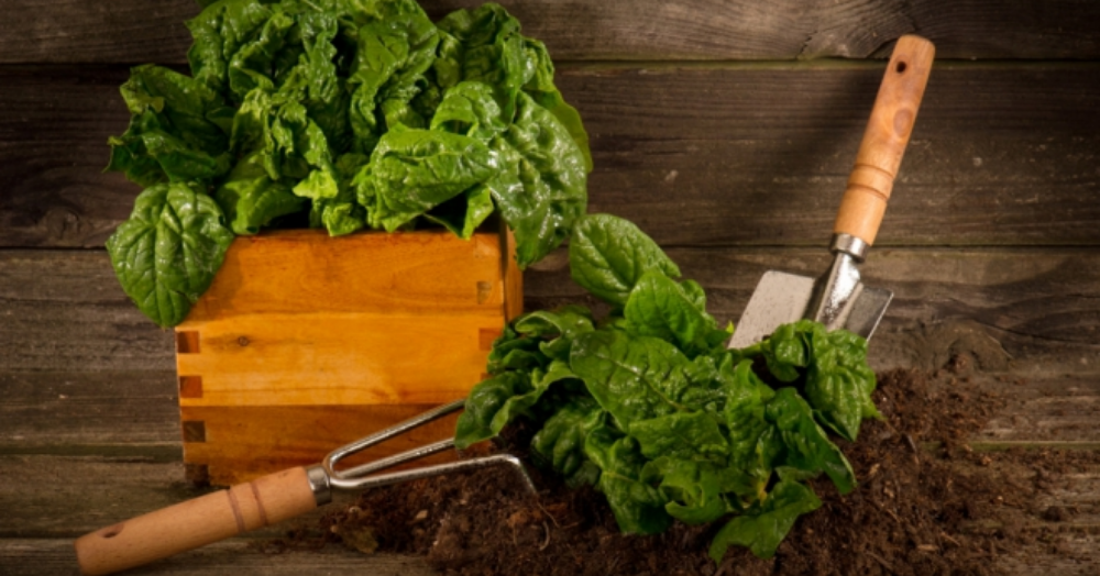
Everything you need to know for creating your own kitchen garden🥦🍅🥕
Online searches for ‘how to grow your own veg all year round’ have increased by 80% since this time last year.
This demand for high quality and fresh produce has been driven due to an extra emphasis on sustainability, saving money and removing pesticides from our food and the environment. With this in mind, kitchen retail and design experts, Magnet, have done some digging to reveal the top 20 UK locations for avid gardeners to live based on the average garden size, the number of allotment sites, soil fertility, and the number of days with poor air quality. They have also put together a short guide to help you grow your own fresh and delicious produce - all from the comfort of your own home. To continue reading, please Click Here