House Prices Since The Year 2000!
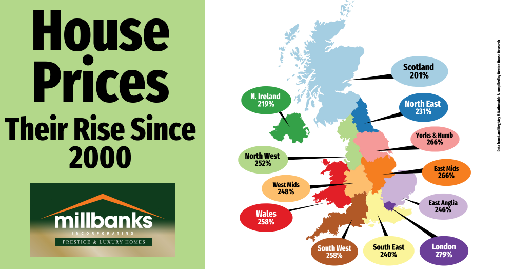
Over the past 25 years, UK house prices have surged, though growth has varied by region. From London’s 279% rise to Scotland’s 201%, the figures highlight both national trends and regional differences. For towns like Attleborough, this long-term growth story offers context for smarter property decisions.
Over the last quarter of a century, house prices have risen sharply across the UK, although the scale of growth varies depending on the region.
Here is how each region has fared since 2000, starting with the highest increases:
· London – up 279%
· Yorkshire & The Humber – up 266%
· East Midlands – up 266%
· Wales – up 258%
· South West – up 258%
· North West – up 252%
· West Midlands – up 248%
· East Anglia – up 246%
· South East – up 240%
· North East – up 231%
· Northern Ireland – up 219%
· Scotland – up 201%
For homeowners in towns like Attleborough, this long-term growth tells an important story. It shows that, despite the ups and downs of the property market, values have historically trended upwards over the years. The figures also highlight the regional differences that can exist, with some areas enjoying significantly stronger growth than others.
Whether you are thinking of selling, buying, or simply keeping an eye on the market, understanding where our region sits in the national picture can help you make better informed property decisions.
For a chat about property related matters, call me anytime on mobile 07970 203228, the office on 01953 453838, or email tony@millbanks.com With over 41 years of experience in property sales and marketing, I’m can offer clear guidance and support every step of the way.
Thank you for reading
If you'd like to find out what your home might be worth in 60 Seconds, please 'click' the banner ad below