How Attleborough Can Celebrate Random Acts of Kindness Day
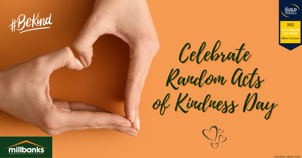
Random Acts of Kindness Day is this Saturday 17th February.
It’s spread globally and is a great opportunity to show how small, thoughtful actions can have a significant impact worldwide and closer to home in Attleborough.
Here are six easy ways to spread a little happiness and strengthen the bonds within our community.
1) Support local businesses
Start by supporting local shops and services. Whether buying a coffee from the local café or choosing a local craftsperson for your next project, your custom helps sustain the livelihoods of those in our community.
2) Share a compliment
Never underestimate the power of a genuine compliment. Whether praising a neighbour’s garden or acknowledging a colleague’s hard work, a kind word can go a long way in brightening someone’s day.
3) Donate to a local charity
Consider donating to a local charity or food bank. These organisations do incredible work, and your contribution, big or small, can make a real difference to those in need.
4) Volunteer your time
Giving your time can be incredibly rewarding. Volunteer at a local school, community centre or charity shop. Even a few hours can have a significant impact.
5) Help a neighbour
Simple acts like helping an elderly neighbour with shopping or offering to walk someone’s dog can foster a stronger, more caring community.
6) Pay it forward
Buy a coffee for the person in line behind you, leave a book in a public place for someone else to enjoy, or simply hold the door open for others. These small gestures of kindness can create a ripple effect of goodwill.
Let’s use Random Acts of Kindness Day as a feel-good springboard to spread smiles and kindness throughout our community, not just on 17th February, but every day.
Together, we can make Attleborough a happier, more connected place for everyone.
