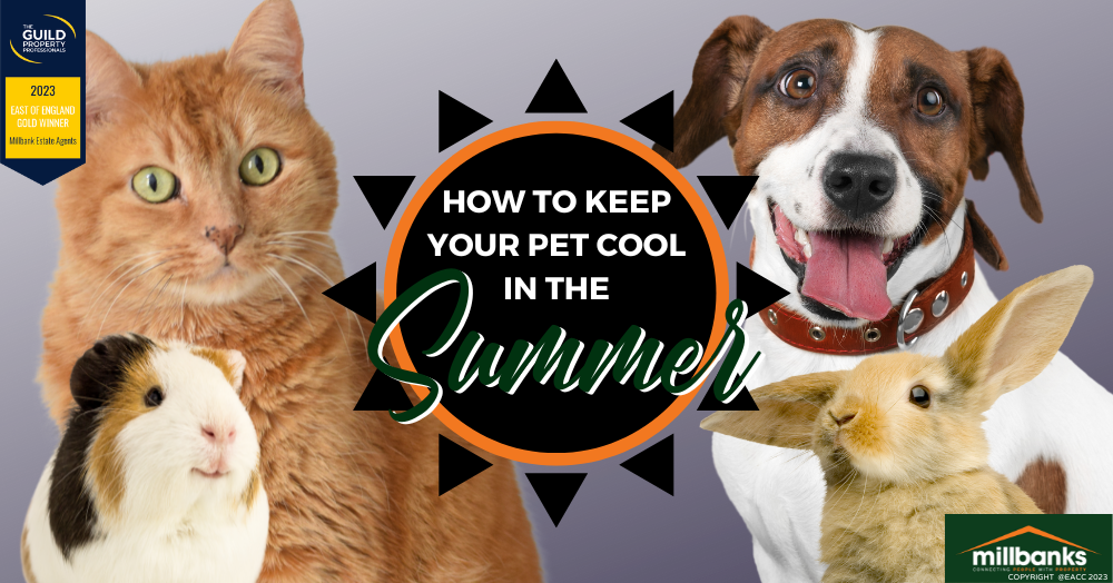
How to Protect Your Pet from the Hot Weather
British summers are hit and miss. On the days you want sun, you get cloudy skies and showers; on the days you’re rushing around doing a million things, you get a mini heatwave. But while we humans can (and should) protect ourselves from the sun, what about our loyal pets?
Every year, temperatures are getting higher, and the UK experiences hotter weather and humidity. And as this month marks International Cat Day (8 August) and International Dog Day (28 August), there’s no better time to think about ways to help our pooches and kitties cool down.
In this quick read, we look at advice from animal experts around how to keep animals safe in the heat.
Water
Giving animals access to water is a must at any time of year, but during the summer months, you may want to add a few additional drinking spots around the home so they can keep hydrated.
Whether you’ve got a cat, dog, rabbit or guinea pig, a bowl of fresh water with added ice cubes is an easy and necessary way to keep the heat away. You can also make water ice lollies as a refreshing treat.
Shade
If you’ve got an energetic pup or an adventurous cat, it might be tricky to keep them in the shade, but if you’re taking them for a walk, try and plan for the early morning or evening instead of when the sun is at its strongest mid-afternoon.
If your pet loves the garden, offer a shaded area where they can enjoy the warmth without direct exposure to the sun.
Animals that live in cages or hutches should be kept in a shady area or brought inside if possible. For indoor pets like birds, fish or lizards, keep their cages/tanks away from direct sunlight and change the water regularly.
Sun cream
Just like us, animals need a bit of added sun protection. Use a pet-safe sun cream on exposed parts of skin like the tips of the ears or nose.
Cool mats
We all know how difficult it can be to get some sleep when it’s hot and sticky, and the same applies to pets. You can buy cooling mats for cats and dogs to sleep on or offer them a damp towel to lie on.
General do’s and don’ts
- NEVER leave an animal in a hot car. Even if you keep the window open, temperatures can rise rapidly and cause serious health problems. Take them out with you or leave them at home.
- Restrict exercise on hot, sunny days to prevent overheating.
- If you’re planning a dog walk, check the pavement. If it’s too hot for your hand, it’s too hot for their paws.
- Watch out for signs of heatstroke in dogs. This includes heavy panting, a quickened heartbeat, glazed eyes, vomiting and a deep red or purple tongue.
How do you keep your pets cool in the summer?