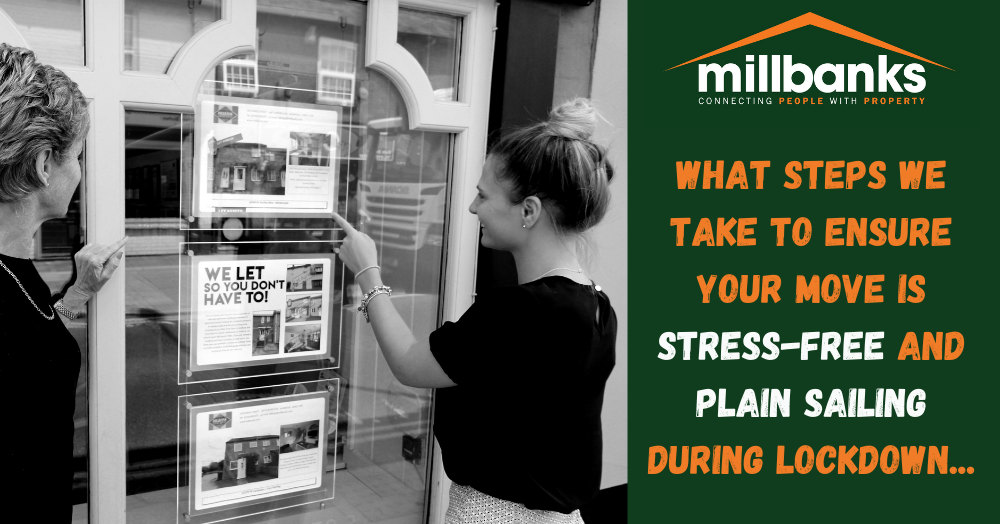
Get in touch with us
What does Attleborough really look like beyond house prices? This map highlights where larger households are most common, revealing where families and shared living arrangements are concentrated. The pattern shows how different neighbourhoods function as distinct micro markets, each shaped by the people who live there. Click to learn more...
This heat map reveals how rental yields vary across Attleborough, with darker areas delivering stronger monthly income and lighter zones producing lower returns. It also highlights a key investor insight: higher yields often sit opposite to long-term house price growth, showing why local strategy matters. Click to learn more...
Timing can make or break a house sale. New Attleborough property market data reveals why the first few weeks are critical, how overpricing can cost sellers valuable buyers, and why homes that sell quickly are far more likely to complete. The numbers tell a powerful story. Click the link to learn more...
Against a noisy global backdrop, the UK housing market has quietly surged, posting its strongest week for sales agreed in 45 weeks. Demand hasn’t vanished, it has sharpened. Well-priced homes are moving fast, while overpriced listings linger, making strategy and timing more critical than ever.