Percentage Change in the Private Rental Sector in the last 40 years
Private renting has grown across every UK region over the last 40 years, but the scale and pace are often misunderstood. This graphic shows how uneven that growth has been, shaped largely by the decline in social housing. Understanding this shift helps explain today’s housing balance and the choices ahead.
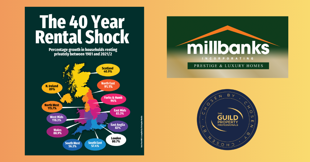
The shift in private renting over the last 40 years is one of the most misunderstood trends in the UK property market. Everyone knows it has grown. Very few know by how much.
This graphic shows the percentage growth in households renting privately in each region since the early eighties. Some areas have risen modestly such as Scotland at 40.9%. Others have risen sharply such as the West Midlands at 118.3 % and the North West at 115.7%. Every region has moved, but the pace has varied.
It is neither a good thing nor a bad thing. It is simply what has happened.
It is worth remembering that today we still have a very high number of homeowners compared to the early eighties. What has changed more dramatically is the level of social housing. As the social sector shrank, the private rental sector grew to fill the space.
This is why understanding the mix of tenures matters. The property market can only go three ways for households. People can own. People can rent privately. Or people can rent socially. Every long-term trend sits within that triangle.
So, the real question is not whether private renting has grown. It clearly has. The question is where the balance goes next.
More social housing? More homeownership? More private renting? Or a blend of all three?
There is no right or wrong answer. There is only the direction we choose to take and the policies that shape it.