Record number of sellers in promising start to 2025, but uncertainties ahead!

Record number of sellers in promising start to 2025, but uncertainties ahead!

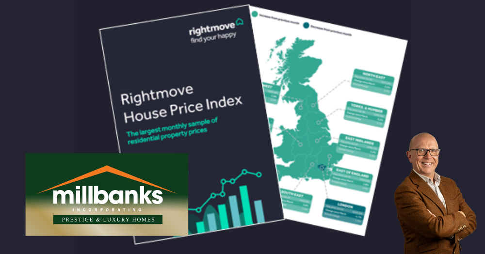
The first 2025 Rightmove House Price Index was released this morning

The headlines that a record number of sellers have come to market since Boxing Day, giving buyers the highest level of choice at this time of year for ten years.
Average prices have also risen by 1.7% (+£5,992) this month to £366,189 – the largest jump in prices at the start of a year since 2020.
Despite the promising start, some uncertainties lie ahead, including the pace and number of interest rate drops this year and the impact of the stamp duty deadline on 31st March. To read the new Rightmove House Price Index please click this link, take me to the New Rightmove House Price Index

A record number of sellers have come to market since Boxing Day, giving buyers the highest level of choice at this time of year for ten years.
Average prices have also risen by 1.7% (+£5,992) this month to £366,189 – the largest jump in prices at the start of a year since 2020.
Despite the promising start, some uncertainties lie ahead, including the pace and number of interest rate drops this year and the impact of the stamp duty deadline on 31st March. 


Get in touch with us

The UK housing market may look balanced at first glance, but property trends tell a very different story when you zoom in locally. The mix of homes in an area shapes buyer demand, property values, and selling speeds. National data sets the scene, but local insight reveals what really drives your market. Click the link to learn more...

Curious about what is happening in the Attleborough property market? Our latest April House Price Review explores local pricing trends and what they could mean for homeowners and landlords. Understanding market movements can help you make smarter property decisions. Click the link to learn more...

This map reveals how detached homes are spread across Attleborough, highlighting neighbourhood differences in housing types. Darker areas show higher proportions, while lighter zones reflect more terraces, semis and flats, with a clear pattern of detached homes on the outskirts shaped by historic growth and urban expansion. Click to learn more.

What does Attleborough really look like beyond house prices? This map highlights where larger households are most common, revealing where families and shared living arrangements are concentrated. The pattern shows how different neighbourhoods function as distinct micro markets, each shaped by the people who live there. Click to learn more...