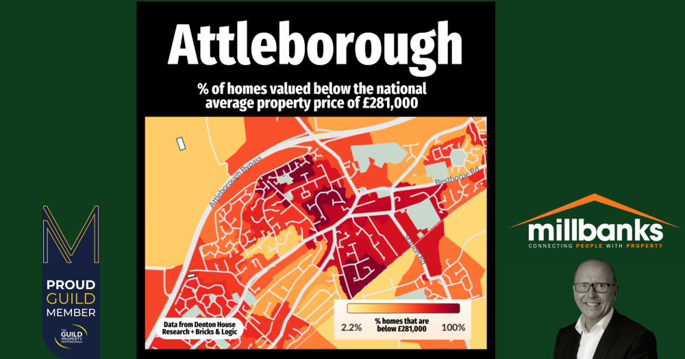
Mapping Attleborough: Areas with Homes Below the National Average House Price of £281,000
Our latest heat map provides a detailed view of Attleborough's property market, illustrating the percentage of homes valued below the national average price of £281,000 in the different neighbourhoods and areas of the Attleborough and surrounding area.
Our latest heat map provides a detailed view of Attleborough's property market, illustrating the percentage of homes valued below the national average price of £281,000 in the different neighbourhoods and areas of the Attleborough and surrounding area.
This visualisation not only helps prospective Attleborough buyers understand where more affordable homes are located but also provides sellers with insights into current market conditions in their locality.
As estate agents in Attleborough, we believe this tool will aid in making informed decisions in this dynamic property market. Are there any surprises in here? Please do share them in the comments below.