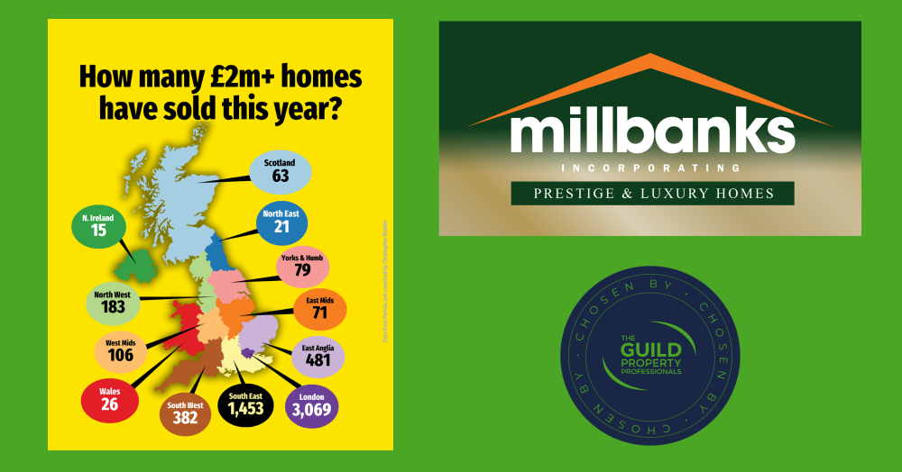
£2m plus sales in the UK this year, and what they tell us
With plans announced to raise the council tax surcharge on higher-value homes, this snapshot looks at how many £2m-plus properties have actually sold across the UK this year. The data shows a highly concentrated market, dominated by London, and reveals just how small this sector is nationally despite the noise around a “mansion tax.”
With the Chancellor confirming plans to increase the council tax surcharge on higher value homes in England, often described as a mansion tax, it felt timely to look at how many £2m plus homes have actually sold in the UK this year.
The numbers show a very concentrated market. London leads by a long way, yet the capital only represents 1.782% of all the homes sold this year. That percentage alone shows how small this sector really is once you step back and look at the wider property market.
Outside London, the picture varies sharply across the country. In England the share of £2m plus sales tends to sit between 0.8% in the South East and 0.04% in the North East. Scotland might raise eyebrows because its share is slightly higher than some expect, but areas around Edinburgh and the Lothians have always supported a strong upper market which explains its position.
It is worth stressing that these figures represent only the number of homes that have sold this year, not the full number of homes valued above £2m. Even so, the sales data gives a reliable sense of where genuine £2m plus buyer activity sits across the UK. It also puts the mansion tax debate in context. Most regions see very limited volumes at this level, which suggests the impact will be felt by a very small group of homeowners, concentrated in only a handful of locations.
Understanding where these homes sell, and in what numbers, helps everyone make more grounded sense of the Chancellor’s announcement. It is a small market at national level, yet an important one in a few specific regions.