The towns and cities with the highest value of new home purchases🗺
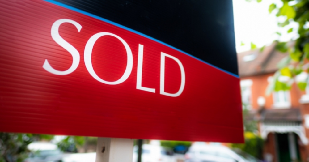
Following a highly challenging period for the new-build sector, 2021 saw almost £6bn worth of new-build property purchased. The latest research from Unlatch, highlights which towns and cities in England and Wales saw the most action.
Unlatch analysed property transaction records from the Land Registry looking specifically at new-build purchases, ranking the nation’s towns and cities on the highest level of new-build value based on the sold prices of these transactions. To continue reading, please Click Here