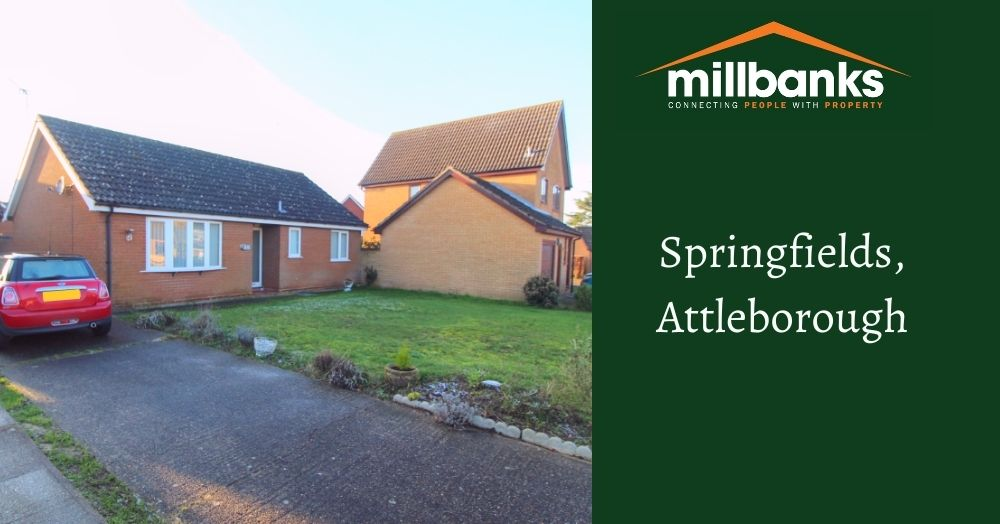
SIMILAR PROPERTIES URGENTLY REQUIRED!


UK rents have risen sharply over the last decade, but the headline figures only tell part of the story. Once inflation is taken into account, some regions have actually seen rents grow more slowly than the cost of living, while others have surged ahead. So where does Attleborough fit into the picture? Click to learn more...
Every home has a story, from first steps to retirement dreams. Property isn't just bricks and mortar; it’s about people, timing, and local confidence. Whether you’re upsizing, downsizing, or just keeping watch, understanding our unique market is key. We look beyond the data to see what’s really happening in our local community.
This heat map reveals how rental yields vary across Attleborough, with darker areas delivering stronger monthly income and lighter zones producing lower returns. It also highlights a key investor insight: higher yields often sit opposite to long-term house price growth, showing why local strategy matters. Click to learn more...
What does Attleborough really look like beyond house prices? This map highlights where larger households are most common, revealing where families and shared living arrangements are concentrated. The pattern shows how different neighbourhoods function as distinct micro markets, each shaped by the people who live there. Click to learn more...